Designing Outside: Matt Hulme
(8 minute read)
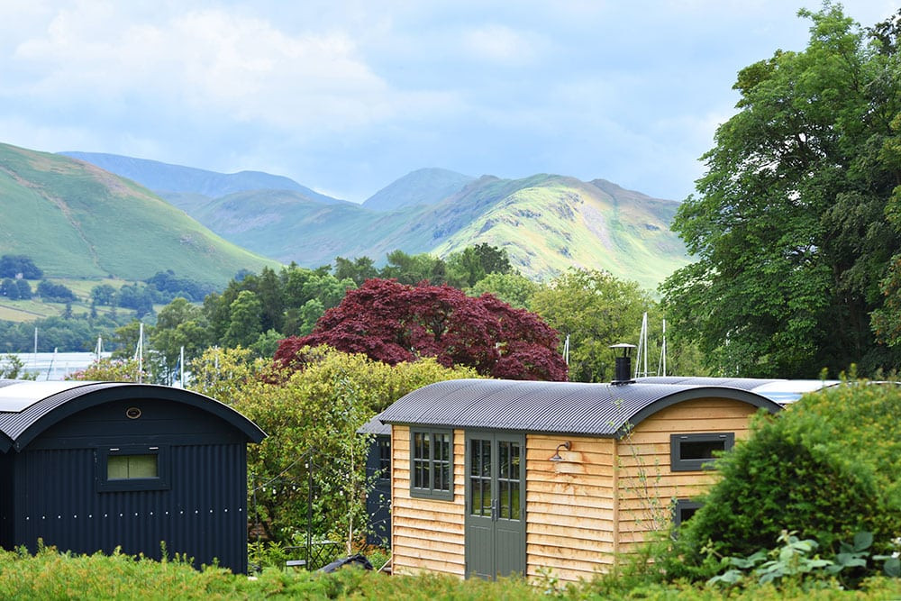
Taking in six shepherd huts and a treehouse, designing Outside’s inside spaces wasn’t exactly your average design brief. But with lake views, landscaped gardens and a cluster of mature trees in the mix, it was a naturally inspiring challenge that sparked interior designer Matt Hulme’s imagination.
Taking us ‘through the keyhole’ of each unique space, Matt shares an insight into his design process – revealing the thinking behind the concepts, layouts, textures, colours and furniture…
Step inside the shepherd huts
We wanted to ensure we were creating something truly unique – a standout experience – with the shepherd huts. We didn’t want them to feel at all twee, but give each space its own character and elements of individuality. No cookie cutter design allowed!
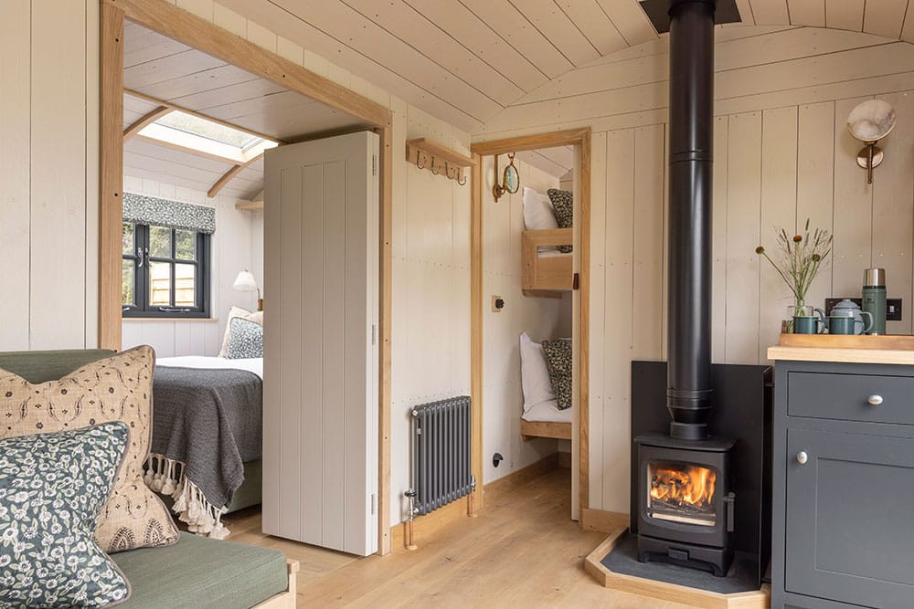
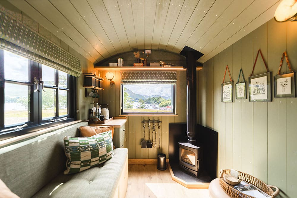
Splitting the shepherd huts into couples and families right at the start, we then focused on the different guest experiences. As the huts are separate from the hotel, we looked at them as self-contained living spaces (albeit with full access to the hotel too). We also had to remember that, during the winter months, guests wouldn’t be outdoors so much, so the interiors needed to be spacious and comfortable, but also have good seating and storage areas.
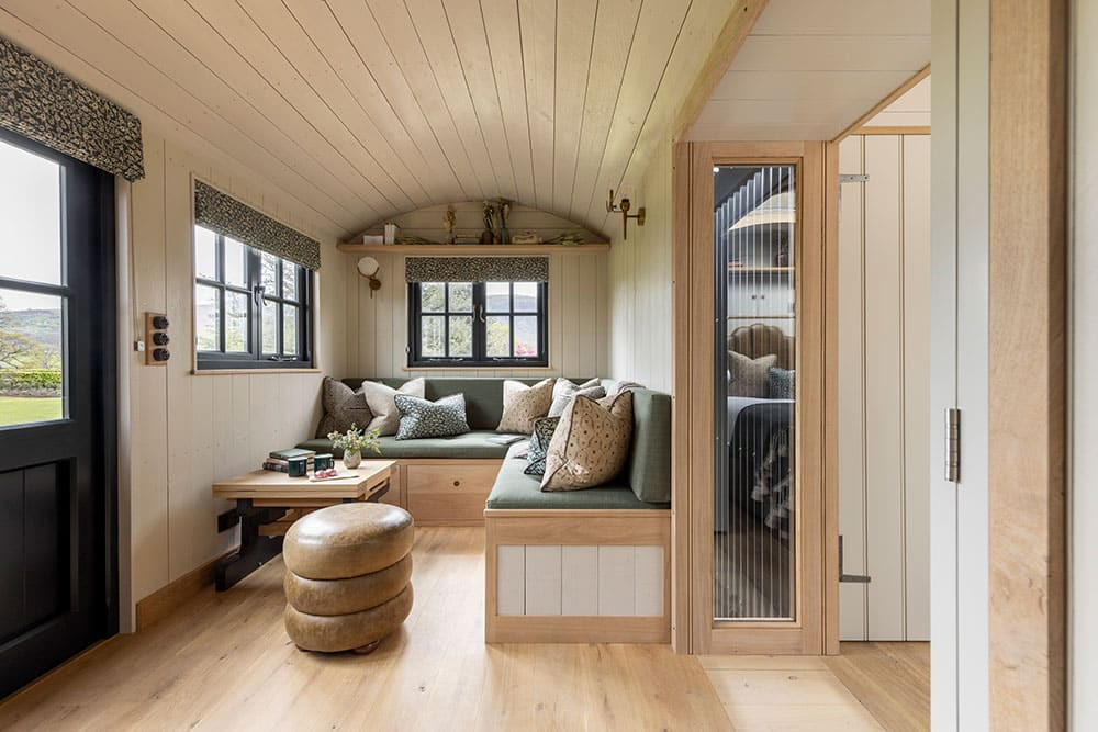
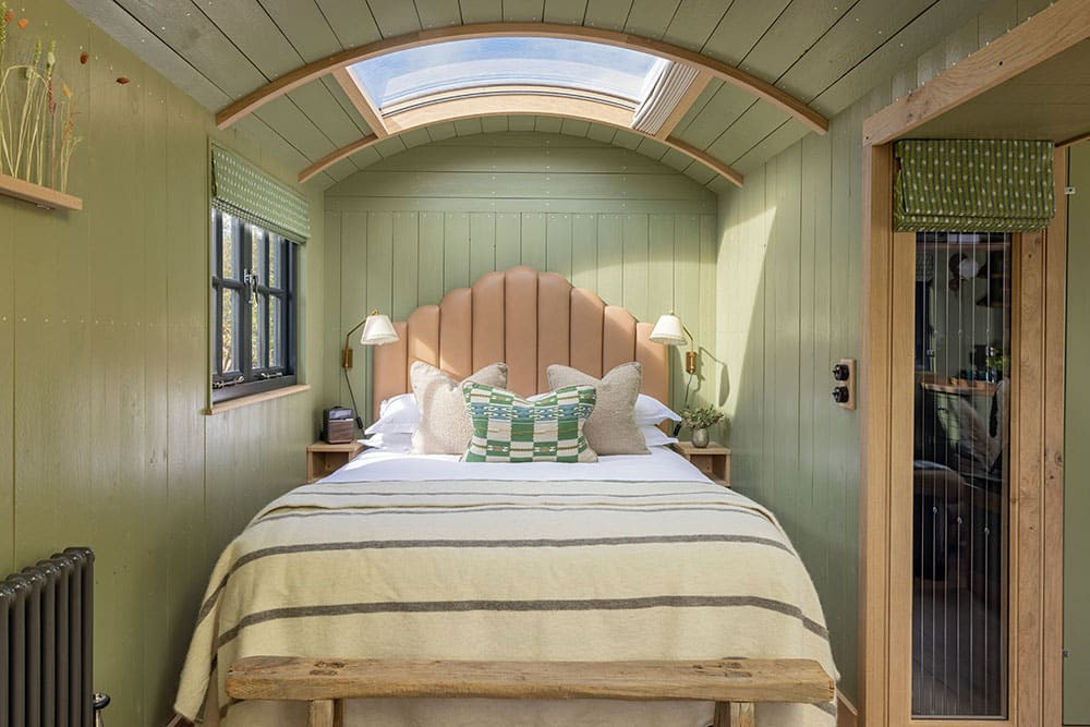
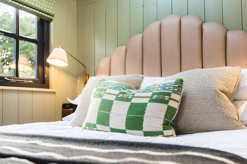
To give each Shepherd Hut its own distinct personality, I used a different colour palette in each – then teamed this with paint, fabrics, furniture, lighting and joinery details. A couple of them are more rich and moody, while others are brighter and lighter. The famously changeable Cumbrian weather means the spaces need to feel inviting and comfortable whatever the season.
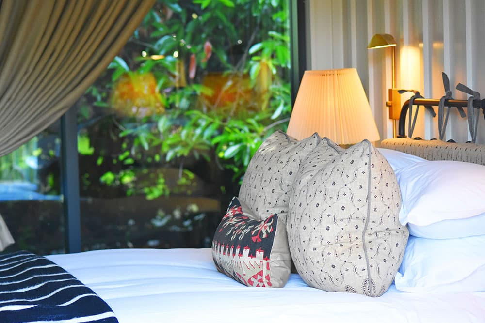
I was keen to bring some of the aesthetics of our recently refurbished hotel bedrooms into the huts, and avoid anything cliché. So, there are cosy bed throws with tassels, shaped headboards, feature lighting and individual artwork – to give a more personal, ‘members club’ feel. I wanted guests to open the door and be wowed.
It was exciting to work with Blackdown Shepherd Huts – a specialist supplier from the South West – and really drill down into how to make our huts feel unique to Another Place.
I wanted guests to open the door and be wowed.
Transforming the treehouse
The treehouse was a more unique project, partly due to its architectural design but also its distance from the hotel. I wanted to really embrace the hidden-away feel of its location. Again, it was all about first impressions – I wanted to create a real sense of anticipation and excitement for guests as they walked along the bridge towards the treehouse door.
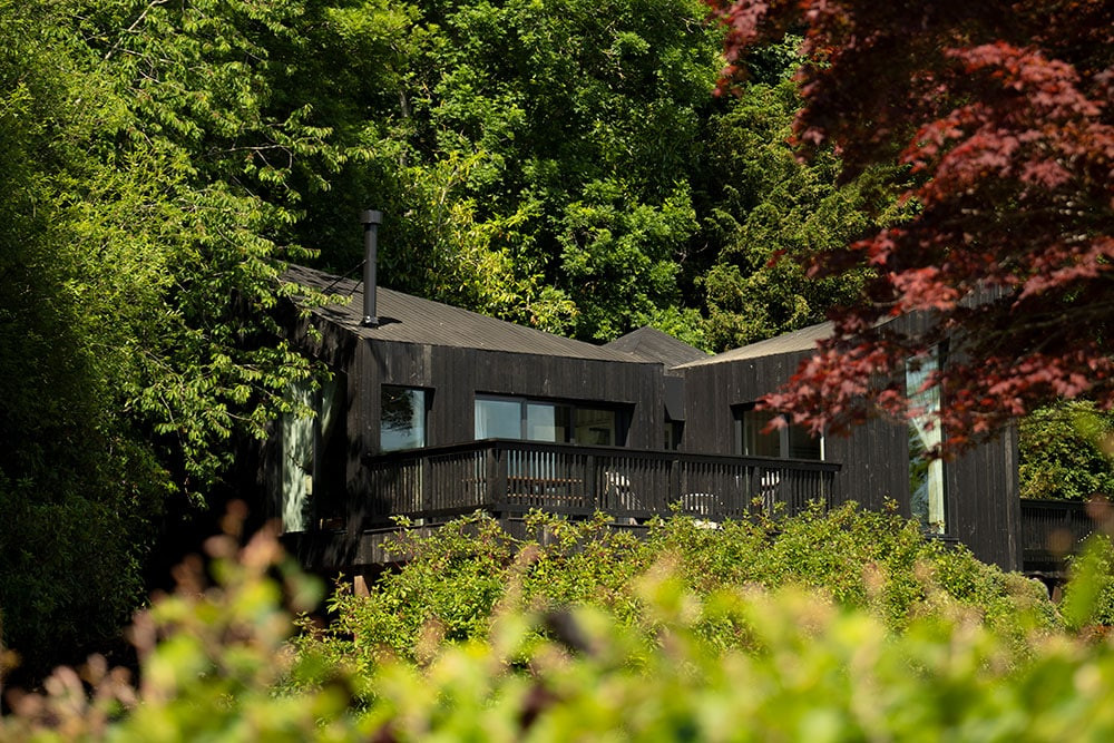
My starting point was to review the architectural design and details. As it’s such a one-off building, I needed to be sure that it not only worked for the guest experience, but also that the interior didn’t jar with the key architectural factors – like the sharp angles and black cladding.
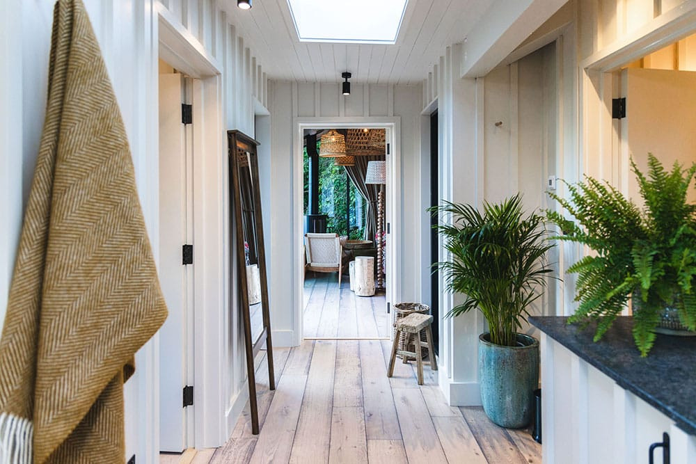
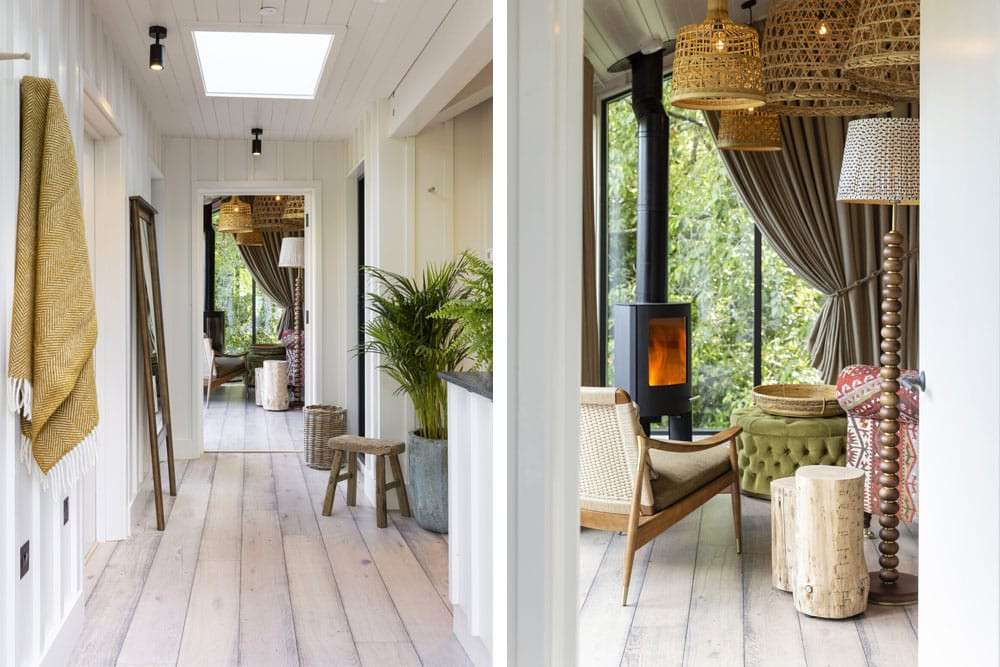
I wanted to create a view from the treehouse entrance into the living area, giving a hint of the furniture, lighting and fireplace – a tease of the space as soon as you step inside. Then, when you move into the lobby area, you get a peek of the second bedroom, a glimpse of the bathroom and a view into the main bedroom.
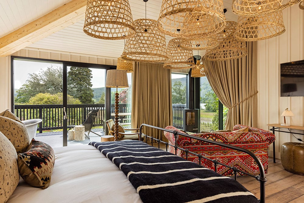
From very early on, I wanted the Treehouse to be a calm and soft space, to juxtapose with the structural elements of the architectural design. So, I looked at how we could create warmth through texture and materials, with a reclaimed timber floor, gentle lighting, vintage style furniture, simple textured wall panelling and subtle nods to being in a treehouse, without becoming twee or themed.
We created a link between the black external cladding and the interior by using blackened bronze ironmongery and black tapware.
As with the shepherd huts, I wanted the treehouse to feel connected aesthetically to the main hotel. So we used similar soft furnishings and hints of the same colour palette – while also ensuring the space had its own identity.
I was inspired by the local landscape at different times of the year, with one scheme based around the rich, chalky green of the fells in summer, and another inspired by the burnt colours of the bracken and ferns during winter.
A natural palette
The palette of colours, textures and materials evolved very organically. With the shepherd huts, my starting point was actually a fabric that I then based the rest of the design around – pulling out the paint tone, lighting and artwork.
I was inspired by the local landscape at different times of the year, with one scheme based around the rich, chalky green of the fells in summer, and another inspired by the burnt colours of the bracken and ferns during winter.
I wanted to create an eclectic and lived-in look for the treehouse – nothing stark or cold, so I spent time sourcing individual pieces of furniture that would fit with the overall feel.
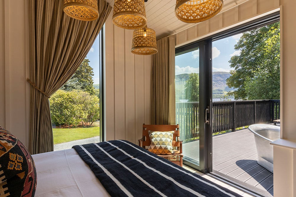
When you’re lying in the master bed, you can look out one window and see the greenery enveloping the building and really feel like you are within the trees.
Blurring the boundaries between outside and in
Right from the start, I loved the idea of creating new spaces within the hotel grounds that would draw guests out into the landscape. I was excited about bringing ‘outside’ into the heart of guests’ stays.
To really pull guests outside and experience something they wouldn’t at home, I was determined to include an outdoor bath in the treehouse. It’s a beautifully simple tin bath outside on the deck, angled so you can sit and look at the lake as you soak.
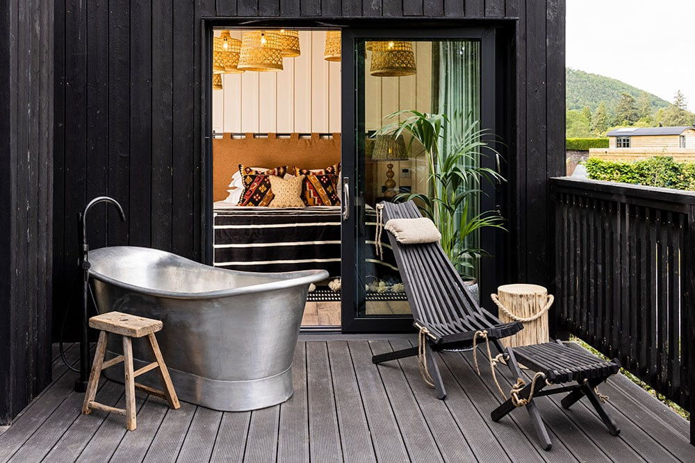
The treehouse has lots of glass, which initially proved a challenge for planning the interior. Early on, we stood on the excavated site to try to understand what the views would be, so that our layouts made the most of them. Now, when you’re lying in the master bed, you can look out one window and see the greenery enveloping the building and really feel like you’re within the trees. Then, looking out of the other windows, you see past the log burner and out to the lake behind.
The log burner location was also key; placed in the corner of the room, it’s a focal point of the space – but doesn’t distract from the view. I wanted guests to be able to sit and enjoy the fire while also taking in the beauty of the view outside.
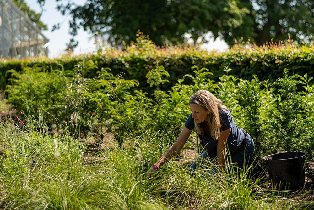
It was wonderful to work with Laurel Truscott, our landscape architect – and understand her vision for the landscaping and planting, to ensure a cohesive flow between outside and in. We worked together to design the individual seating areas in a way that would draw guests out and really make them feel part of nature.
Sustainable by design
We sourced a reclaimed oak timber floor to run throughout the treehouse, which was finished with a simple white wash to link with the wall colour.
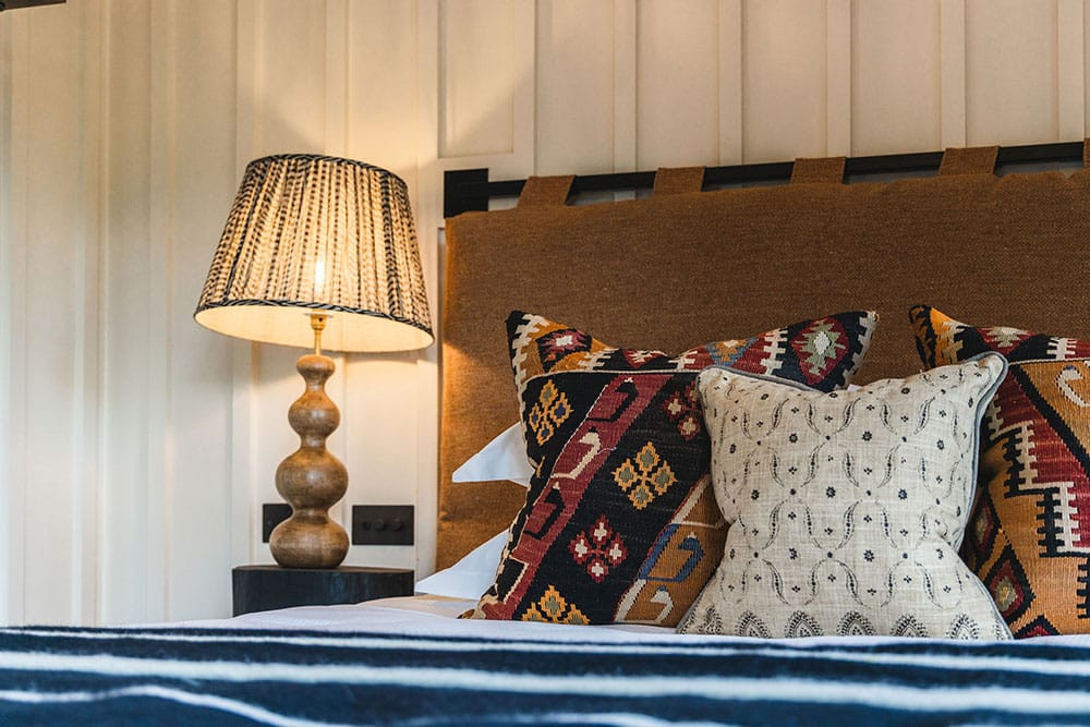
Sourcing vintage textiles and furniture was a central aspect of the design. I had an old sofa reupholstered in a vintage Kilim rug, so that it became a pop of colour in the main treehouse bedroom, and used some vintage Kilim bed cushions for the second bedroom. To create that collected and lived-in feel, I found some lovely vintage rugs for the floor and vintage armchairs for the living room.
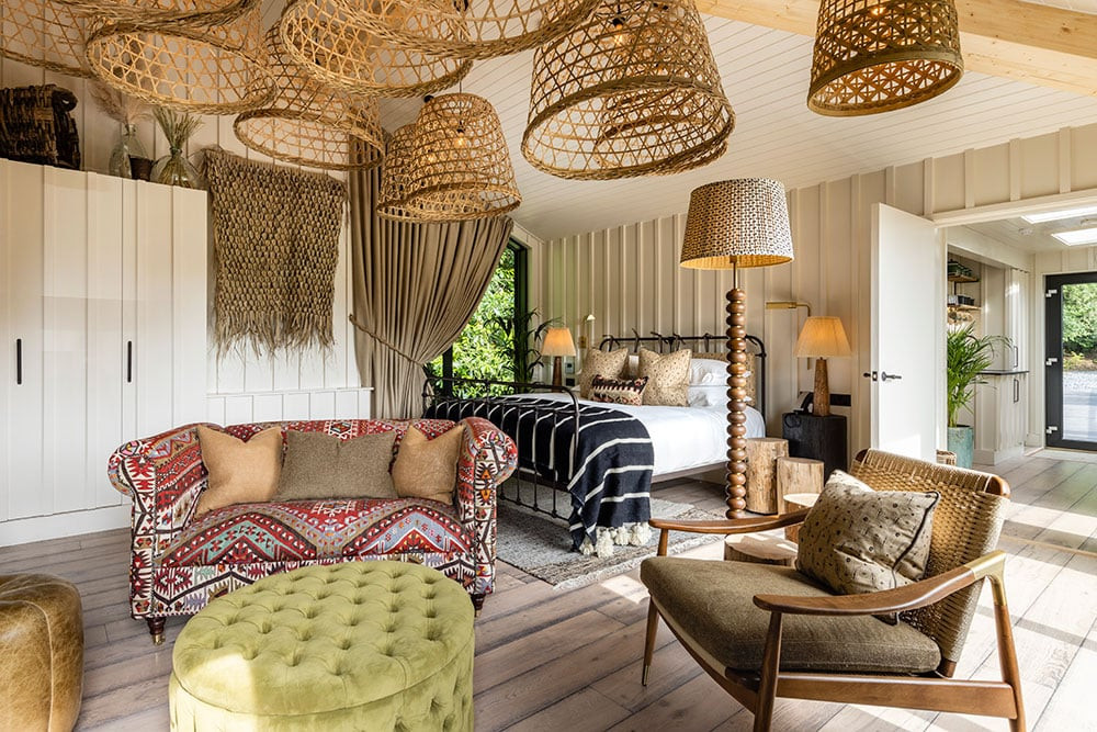
Bedside tables and side tables were handcrafted by a Cornish supplier and made from pieces of local oak. I had the bark stripped, and some of them burnt and ebonised to link back to the treehouse’s black cladding.
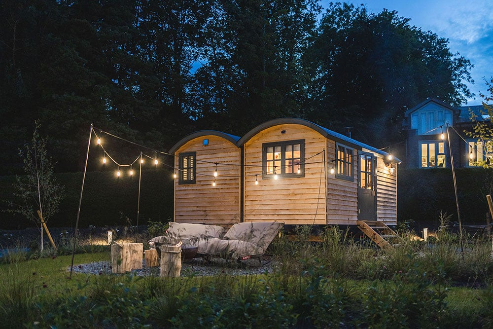
I walked past the shepherd huts recently and saw a family sitting on the bean bag rockers around the fire pit, toasting marshmallows and wrapped in the blankets I had put there…it made me feel very proud and happy.
Making memories
I hope people will feel at home when they step into these spaces. A central part of my design aesthetic is to create a space where guests are instantly comfortable and at ease.
When I was at the hotel recently, I walked past the shepherd huts and saw a family sitting on the bean bag rockers around the fire pit, toasting marshmallows and wrapped in the blankets I’d put in the hut for just that purpose. I felt so thrilled that guests were using the spaces exactly how I’d hoped. Thinking that I’d helped create this memory for them – that it might be something that those children will remember for a long time – made me feel very proud and happy.
3 favourite details
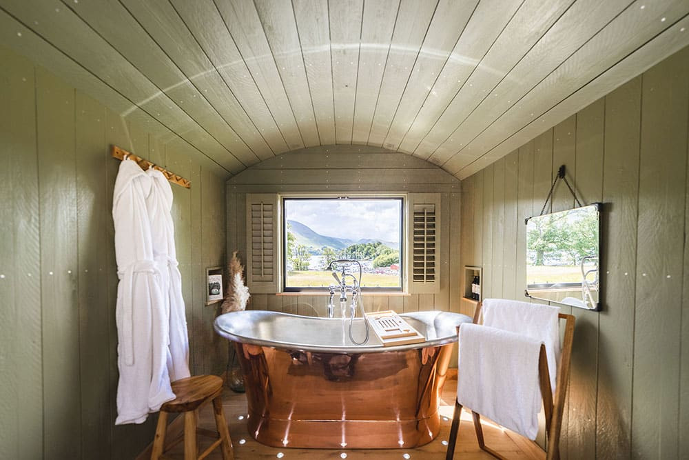
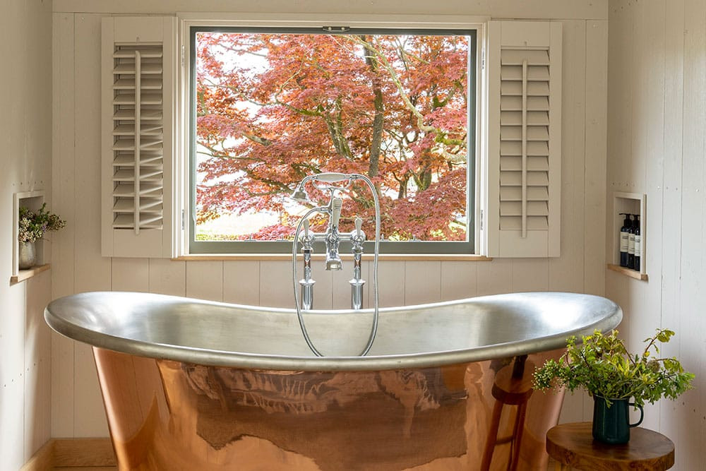
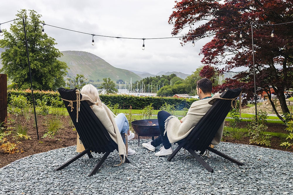
I love the location of one of the couple’s huts and how the surface of the copper bathtub reflects the maple tree outside. It really connects the indoor and outdoor spaces.
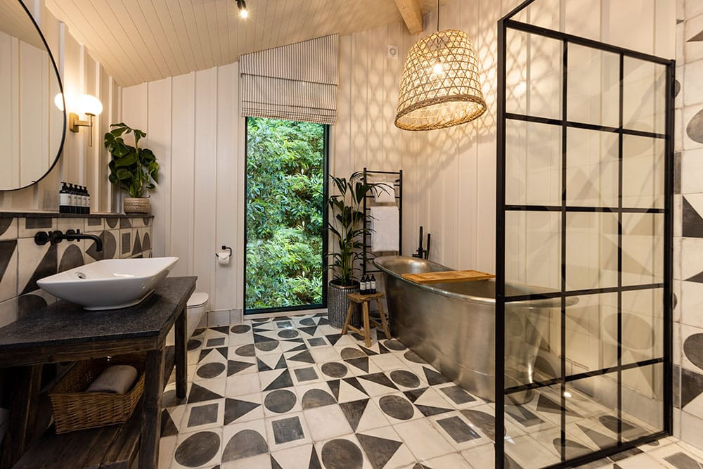
For me, the treehouse bathroom is very special – it’s large and airy but also feels warm and cosy.
My favourite interior view is from the treehouse entrance into the master bedroom. You get a glimpse of the fireplace behind the armchair and a tease of the pendant lighting beyond.
